
For the last two years, I’ve been the art director of a 65-person Burning Man theme camp called My Dad’s House.
This project has been an extraordinarily rewarding creative endeavor, and serves as a great showcase of my skills as a designer, team leader, fabricator, and artist.
My Dad’s House is a community project in which members ask the question: what would it look like if your friends were your parents? What if we showed up for each other in the ways we wish our parents had: providing support, teaching skills, and encouraging a sense of childlike wonder & play?
As the Art Director of My Dad’s House, I’ve guided the project from the initial establishment of an aesthetic direction all the way to leading a team in the construction of a sizable performance venue.


Project Goal
Create a cohesive, artful public space that visually represents our camps values and aesthetics. Additionally establish a visual framework to help guide other contributors towards a common aesthetic goal.
My Role
Art Direction, Project Management (digital + on-site), Branding, Experiential Design, and so much more.
First Steps
Existing Aesthetic
I joined My Dad’s House after it’s inaugural year, so some basic visual direction had been established. It was a camp built from scrap materials by scrappy people! A clear sense of unpretentious DIY playfulness tied everything together.

“We should have a logo!”
Though Burning Man is a “decommodified” space, most larger theme camps have some form of visual identity to use across various collateral in the same way any regular organization would. I stepped up to spearhead this project, visually synthesizing community input based on key themes of: a sense of play, imagery of childhood, and something “kinda derpy”.
First round draft designs:


Second round designs based on community feedback:
We settled on a final design that featured a ‘house like a kid would draw’ emanating multi-color psychedelic waves:
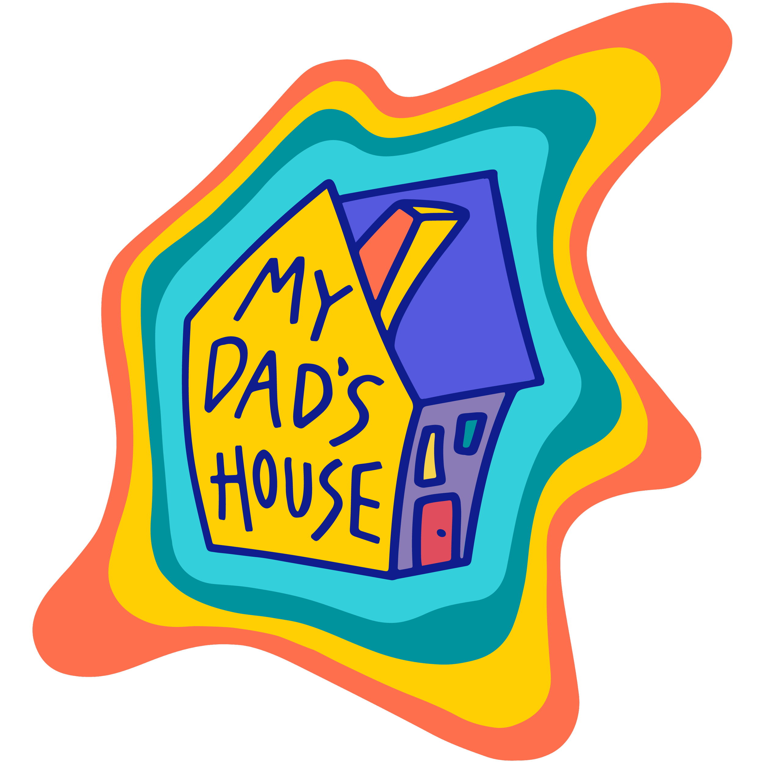
I developed the color palette to evoke feelings of joy, playfulness, and wonder - resonating with childhood enthusiasm. They’re lightly retro (similar to colors used across a lot of 1990’s media) but are clearly not a classic “made for literal children” palette of highly saturated primary colors.

Year One Build (2022)
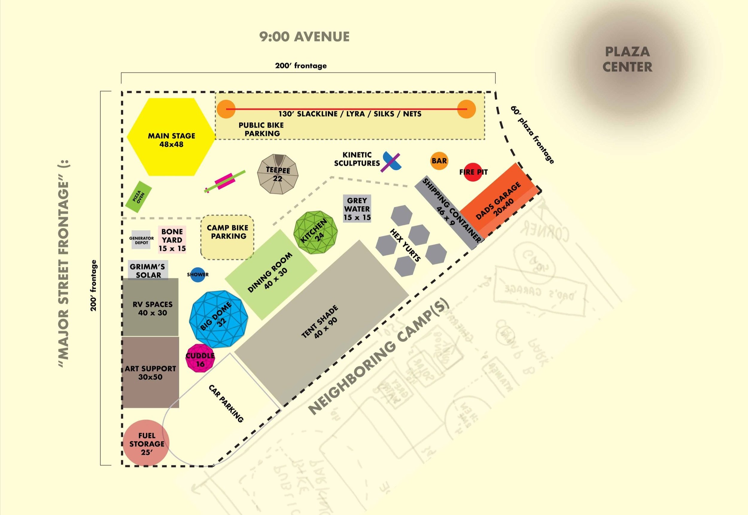
Site Planning
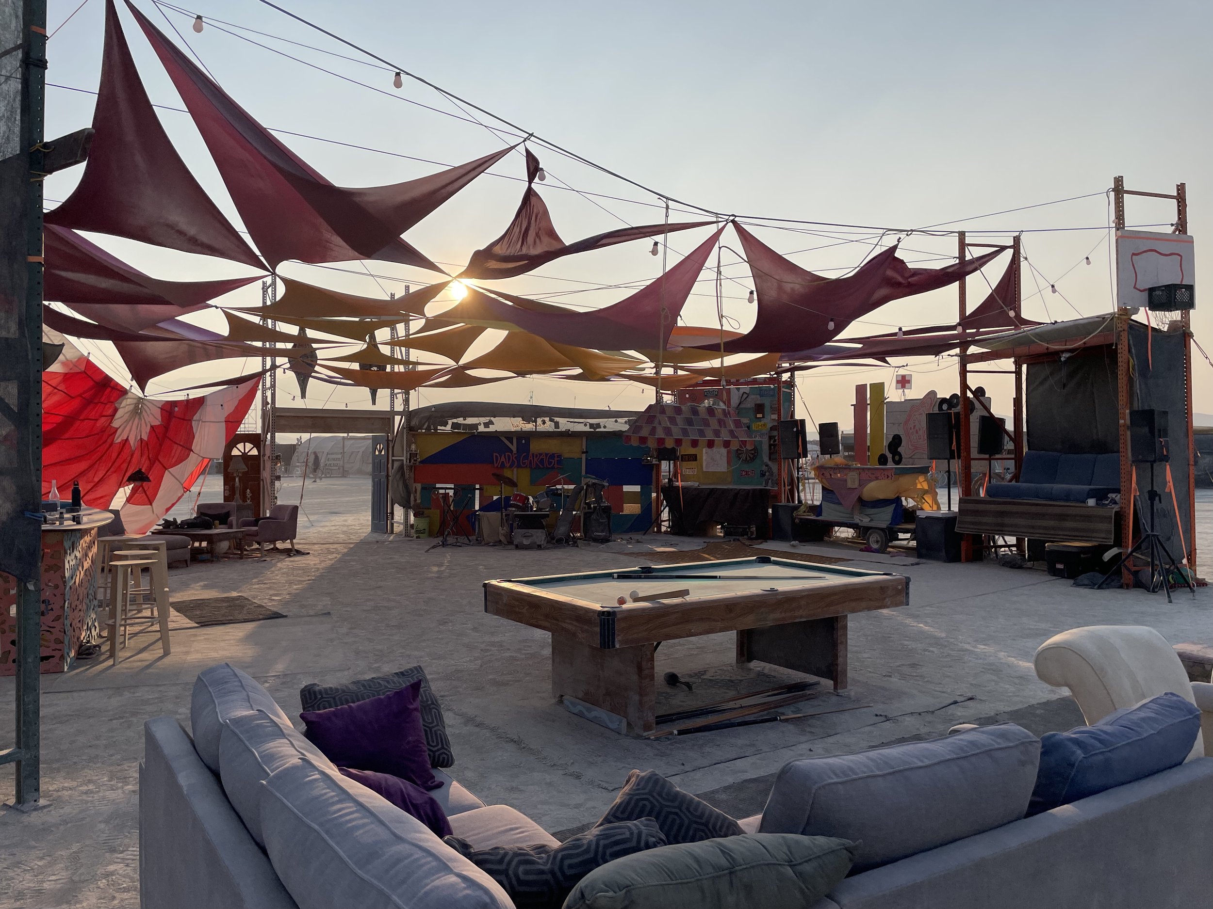
Dusting off the planning skills from my university training in landscape architecture, I collaborated with the camp leads to develop a site plan, organizing the various elements of our 2022 build. This design aimed to create clear delineation between public and private spaces, create a logical flow amongst our public-facing offerings, and establish sound barriers between loud spaces and areas where people sleep.
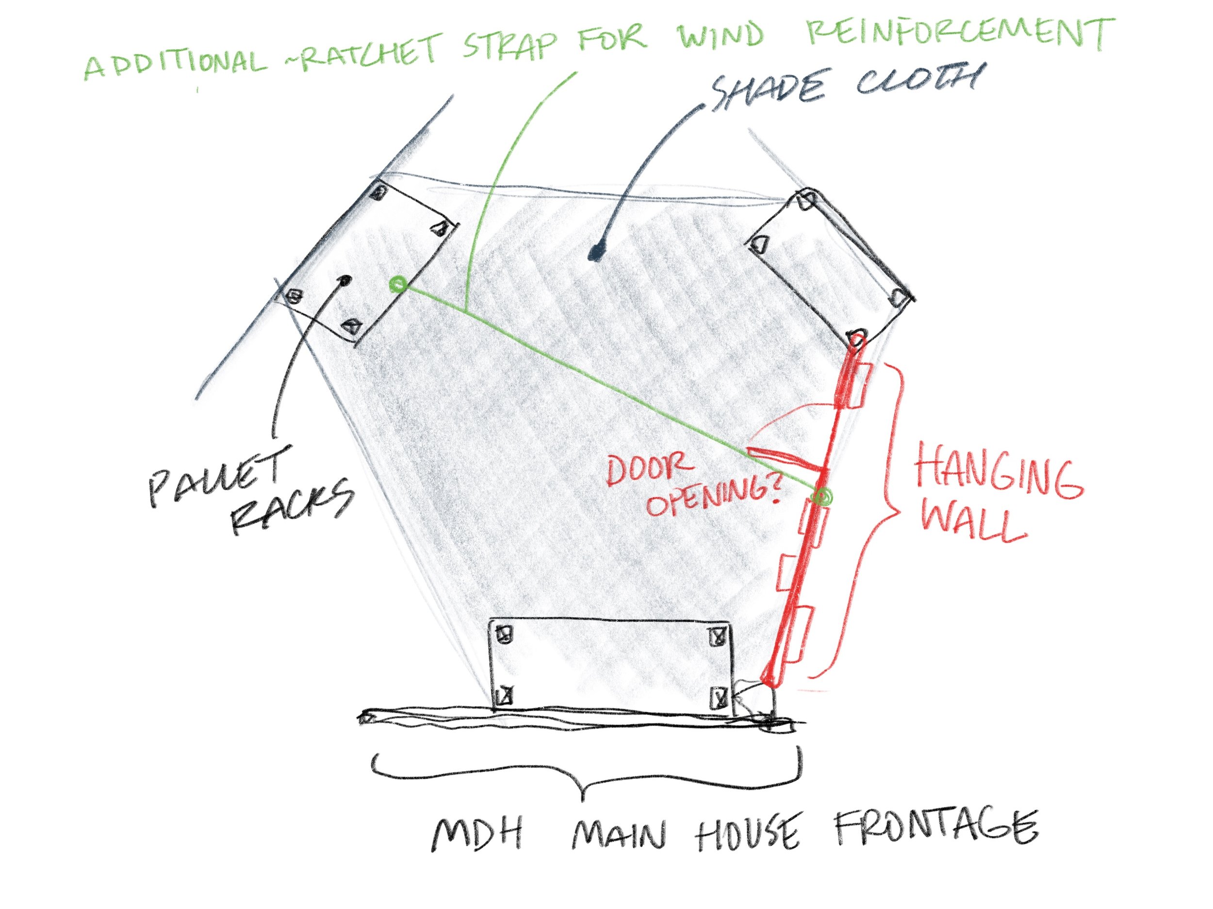
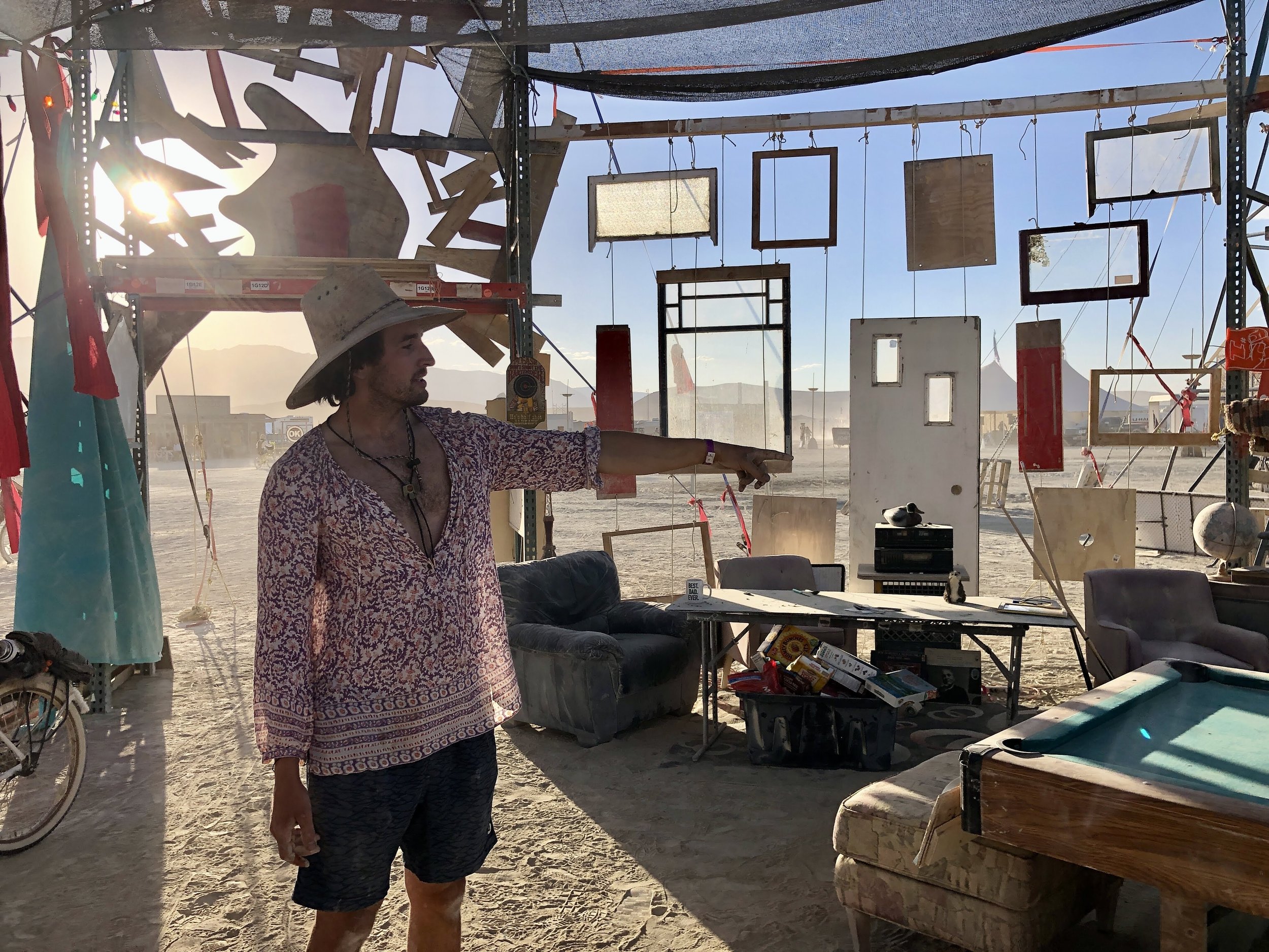
Dad’s Garage
We had new materials, wanted to create a brand new space. I designed a space layout, and a dynamic wall installation repurposing old windows & doors into something that would sway with the wind. This balances aesthetics with flat-pack affordable (or free) materials.

Here’s a few shots from the completed build:


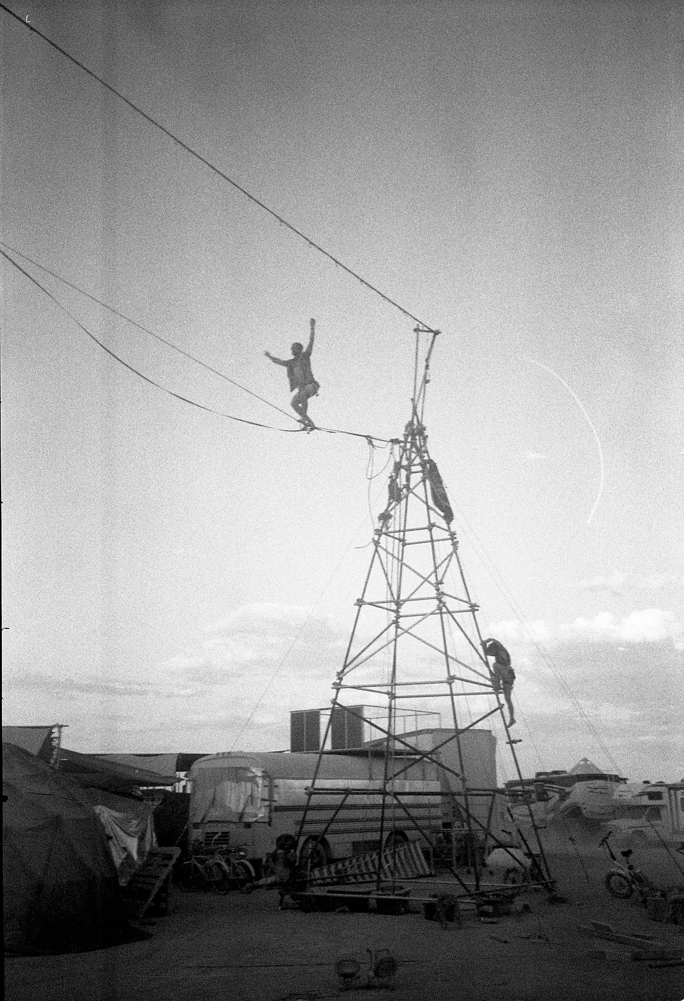
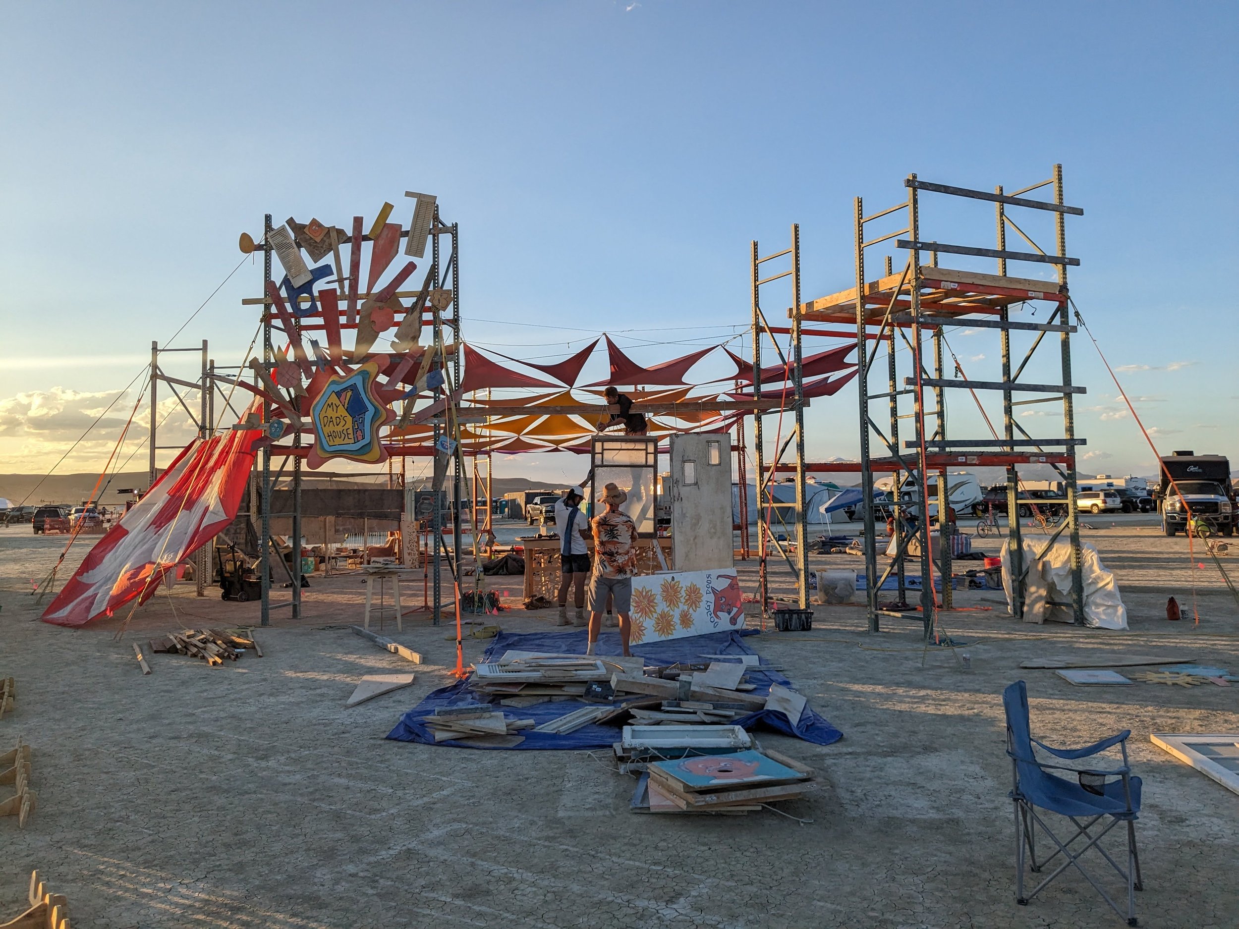
My Dad’s House Sign
Bringing the new logo to life, I designed a multi-layer sign to be cut with a CNC router. In collaboration with my close friend Garth of Franklin Woodworking, we built this 4’x5’ sign. Each layer has programmable chase LED lights routed along the backside, creating a dynamic flowy glow. I then directed a small crew on construction of the surrounding facade, utilizing a radial geometry of scrap wood to create an effect as though the sign had gone SPLAT into the house.


Year Two Build (2023)
Implementing a Full Redesign
For 2023, we decided to integrate our two main spaces (Dad’s Garage & the Main Stage) into one consolidated offering: “The House”. Collaborating again with Garth of Franklin Woodworking, we designed a hexagonal structure with different “rooms” inside. This involved a substantial team effort of sourcing new materials, weighing out cost tradeoffs, and creating a build strategy that would allow us to complete such an ambitious structure in a short amount of time.
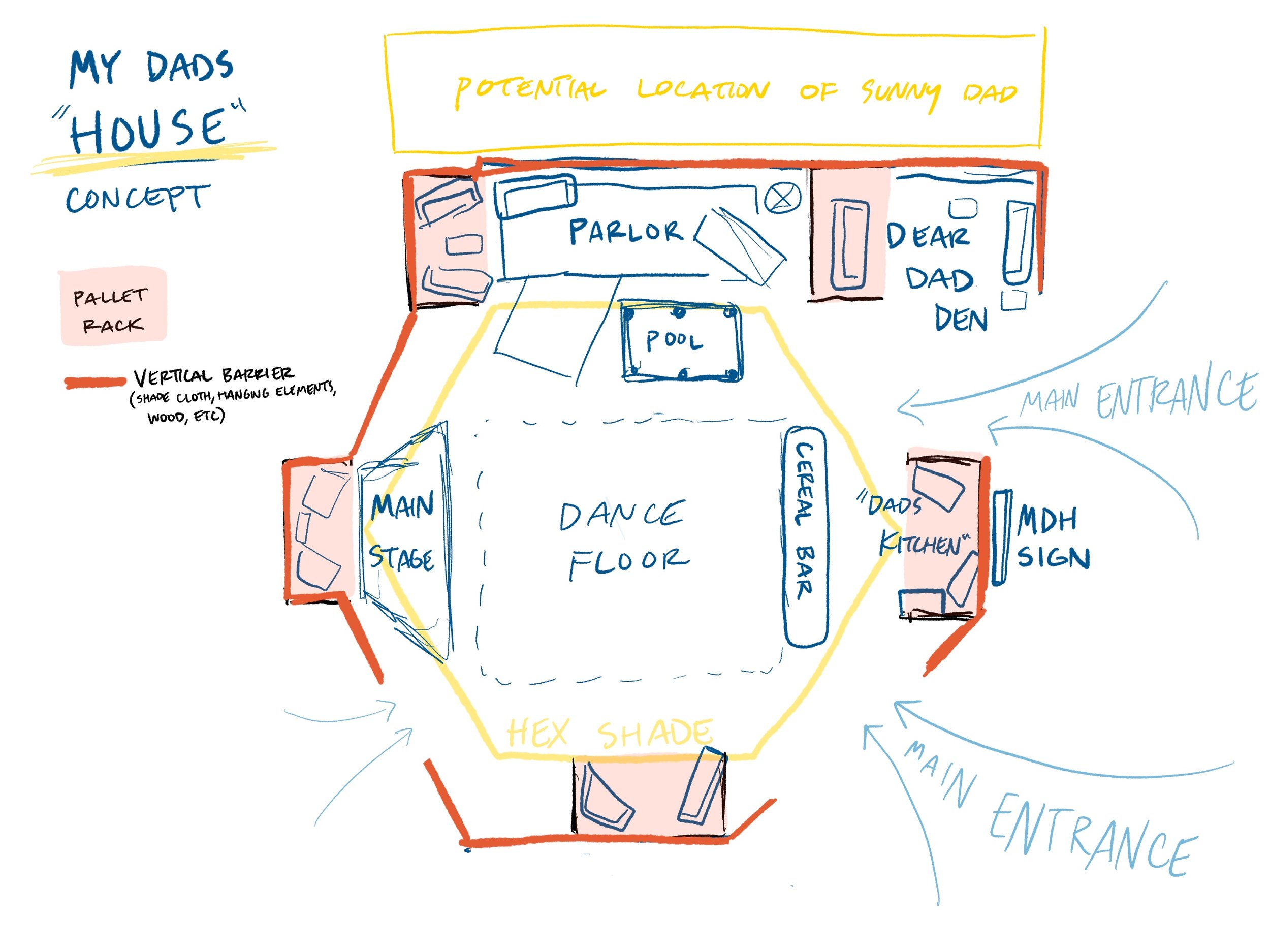


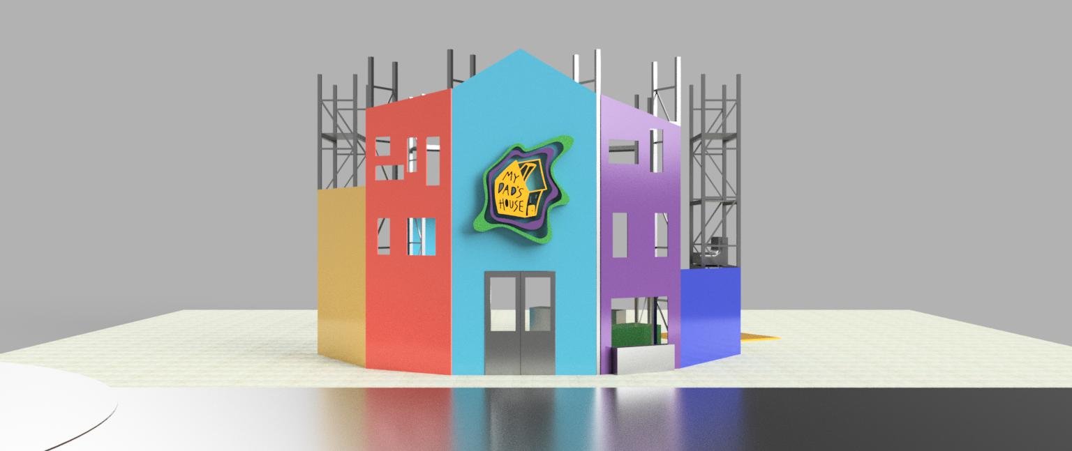
Due to a rain delay, we began construction 3 days behind schedule (on a 6-day build!). I was the build lead for this space, balancing my attention between project management and art direction.
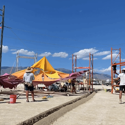
The result was an incredible communal output, touched by many hands. It was an honor to guide this project, and I couldn’t be more proud of the result we co-created:


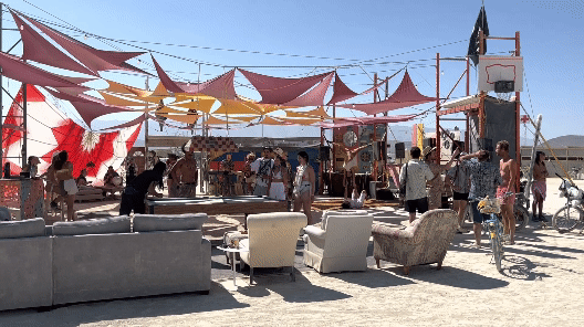


Video walkthrough of the completed space:
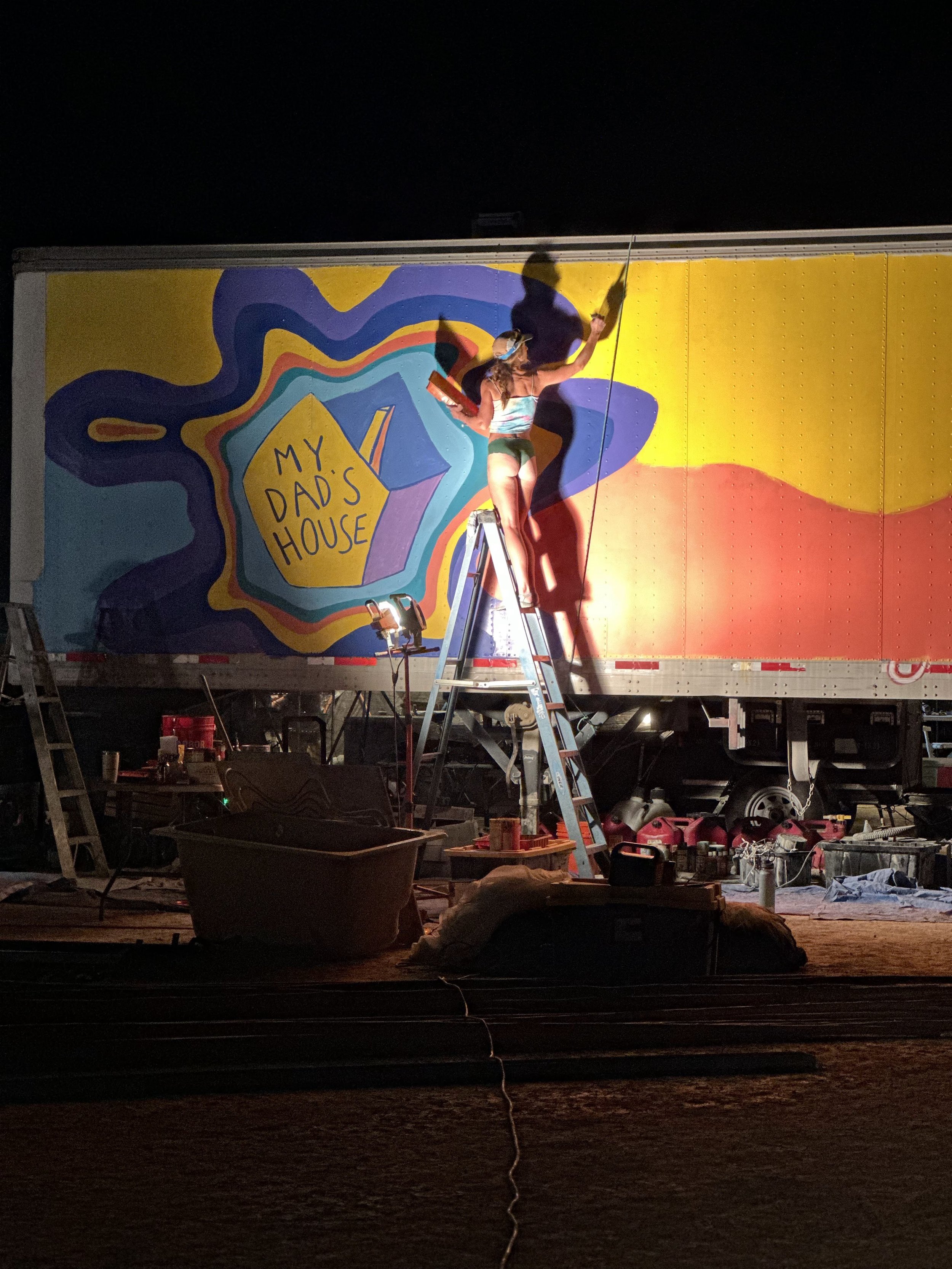
Mural Art Direction
This year we decided it was finally time to fully remove the old Sunny Delight branding from our 45’ semi trailer, replacing it with a fresh mural. I assisted in the initial art direction, trying to balance an aesthetic cohesion with our existing visual identity with ample freedom for our talented muralists (Anna Moore & VITA) to create as they saw fit.

My initial concept sketch:


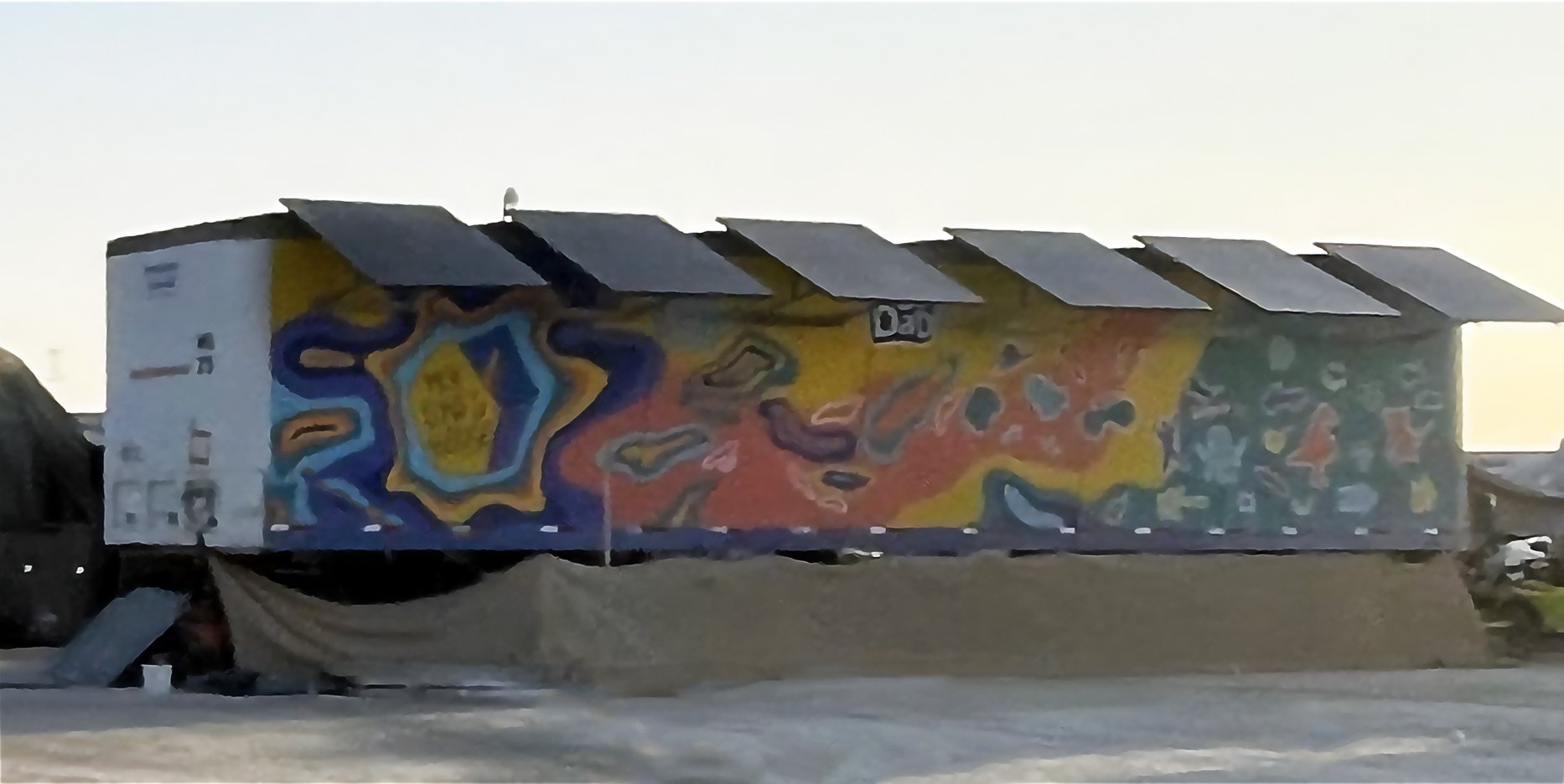
Against all odds, no one remembered to take a proper photo of the mural when it was completed, so these are the best we have so far:
Assorted Assets
Promo Flyers
Creating promotional material for our events is another key part of my role:


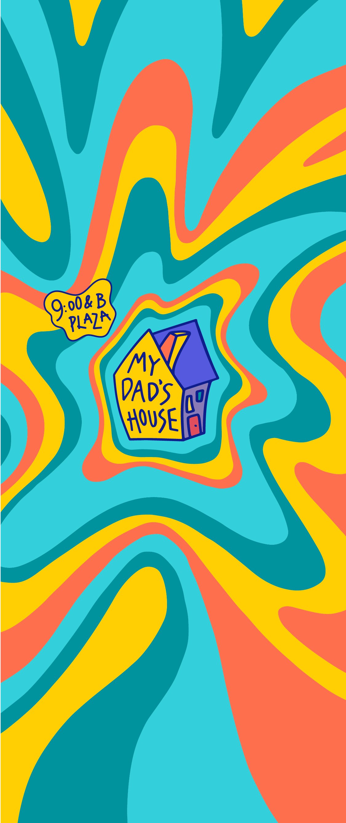
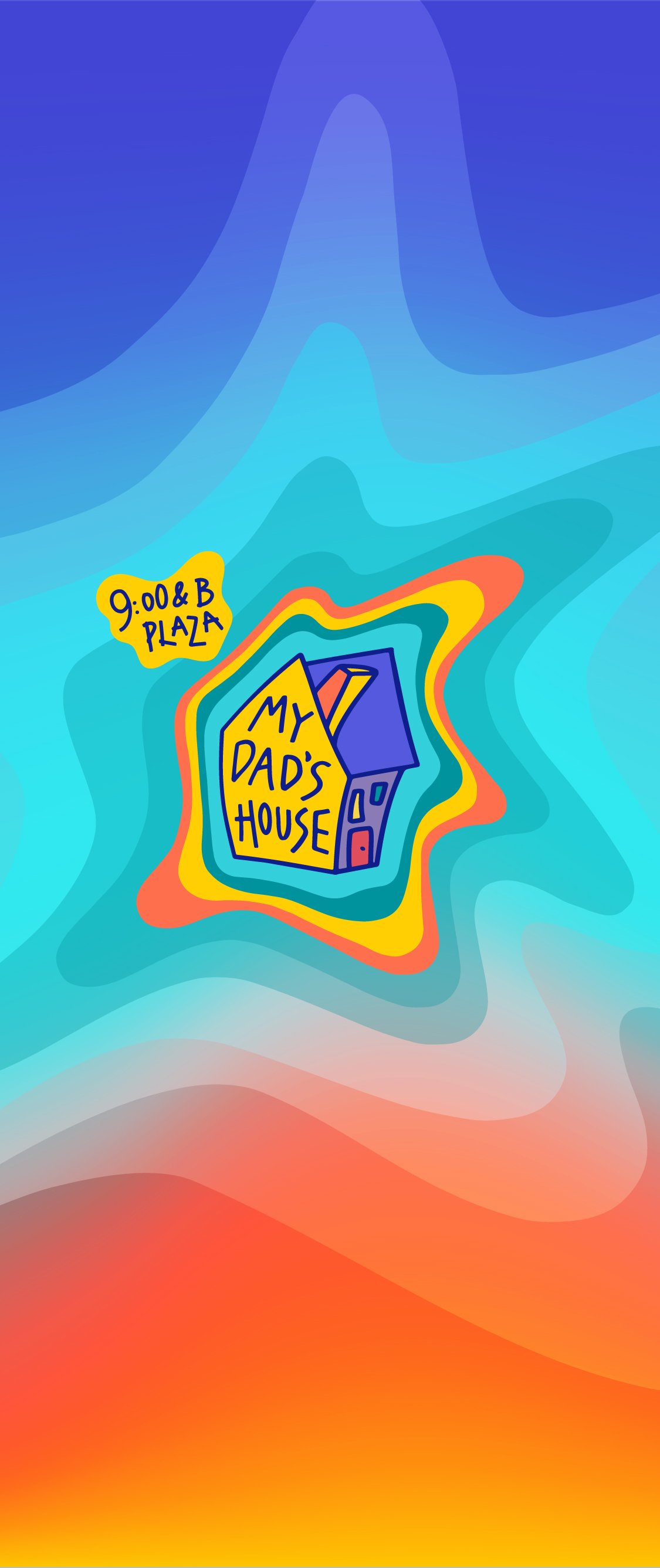
Phone Wallpapers
A classic Burning Man hack is to swap your phone wallpaper to something with your camp’s name & address in case you lose your phone while out on an adventure. These wallpapers have aided in the return of no less than 3 of my friend’s cell phones over the past 2 years!

Repeating Geometry
Fancy arabesque CNC-cut patterns are a hallmark of bourgeoise “plug-n-play” Burning Man camps. We decided to riff on this concept with a pattern of our own, featuring wonky “derpy” shapes and imagery, organized into an infinitely repeating pattern. We then routed this pattern into plywood for use across our camp’s frontage.


In use across the DJ booth & sides of the bar:

In Conclusion
This project continues to be massively rewarding, and indicative of the type of work I’d love to continue working on professionally. I’d love to do more:
Art Direction
Project Management / On-Site Management
Event Production
Experiential Design
If you’re interested in working with me on any of the above areas, please send me an email at parkerjonesdesign@gmail.com.