
How many people do you know who absolutely love dogs but don’t currently have their own?
Dog ownership is a big commitment. Sometimes you just want a furry companion for a weekend hike, or a gentle dog to test out with your kids. Whatever the occasion, there’s Pupr.

Pupr is a case study exploring what a user-centered dog borrowing app could look like. Rather than focusing on dog owners needing dog-sitting, like Rover, this product would serve users looking to borrow highly rated dogs with specific traits.
Project Goal
Help dog lovers find perfectly matched dogs to borrow on a short-term basis
My Role
UX Designer & Researcher
EMPATHIZE
Initial Research
I initially conducted exploratory interviews and created empathy maps to understand the needs of users I’m designing for. A primary user group identified through research was busy millennials who don’t have the current capacity for dog ownership, but engage in different activities for which they wish they had a dog companion.
This user group confirmed initial assumptions about users wanting to search by a dogs fitness level, but also highlighted the need to be able to search by different criteria (ie, ‘crate trained’ or ‘owner delivers’).
DEFINE
User Personas
I crafted two user personas to represent key themes gathered during initial research.


User Journey Map

IDEATE
Competitive Audit
I conducted a competitive audit to examine the strengths, weaknesses, and design solutions of other dog-borrowing services.

Analysis of these findings showed a big opportunity: there isn’t a US-based dog borrowing service that focuses on serving dog lovers.
Concept Development
Using crazy 8s & storyboarding, I quickly iterated and explored potential designs for the app.


PROTOTYPE
I started by creating sketched wireframes in Procreate.
And built a low-fidelity prototype for user testing
TEST
Low Fidelity Usability Study
Research Questions
How long does it take a user to find a suitable dog in the app?
Are users able to successfully send a message request to the dog owner to arrange a date?
What can we learn from the way users find a desirable dog (search vs navigation?)
Are there any missing features or consistent pain points users find while interacting with the app?
Is the search function allowing users to search by their desired characteristics / inputs?
Participants
5 participants, ages 24-50
3 women, 2 men
Non-dog owners who wish they had periodic access to the companionship of a dog
Methodology
20 minutes
Oakland, CA
Moderated Usability Study
Users engaged in a moderated usability study with a low-fidelity prototype
Insights
After analyzing participant feedback using affinity diagrams, I arrived at 3 primary insights:

1. Users want better search customization

2. Users want a more clear starting point on the homepage

3. Users want improved navigation clarity
This informed my priorities for the next round of development
Priority 1
Update search page to allow for greater customization & filtering
Redesign homepage ‘Search’ button for intuitive use
Priority 2
Users need a more simplified navigation and menu design
These priorities were reflected directly in the next round of mockups:


REFINE & HANDOFF
After completing the first usability study, I built a high-fidelity prototype of the app. I then engaged users for a second round of testing to gather additional feedback on the new prototype, made final improvements, and prepped my Figma file for handoff to a dev team.
Mockups
Organized Figma File
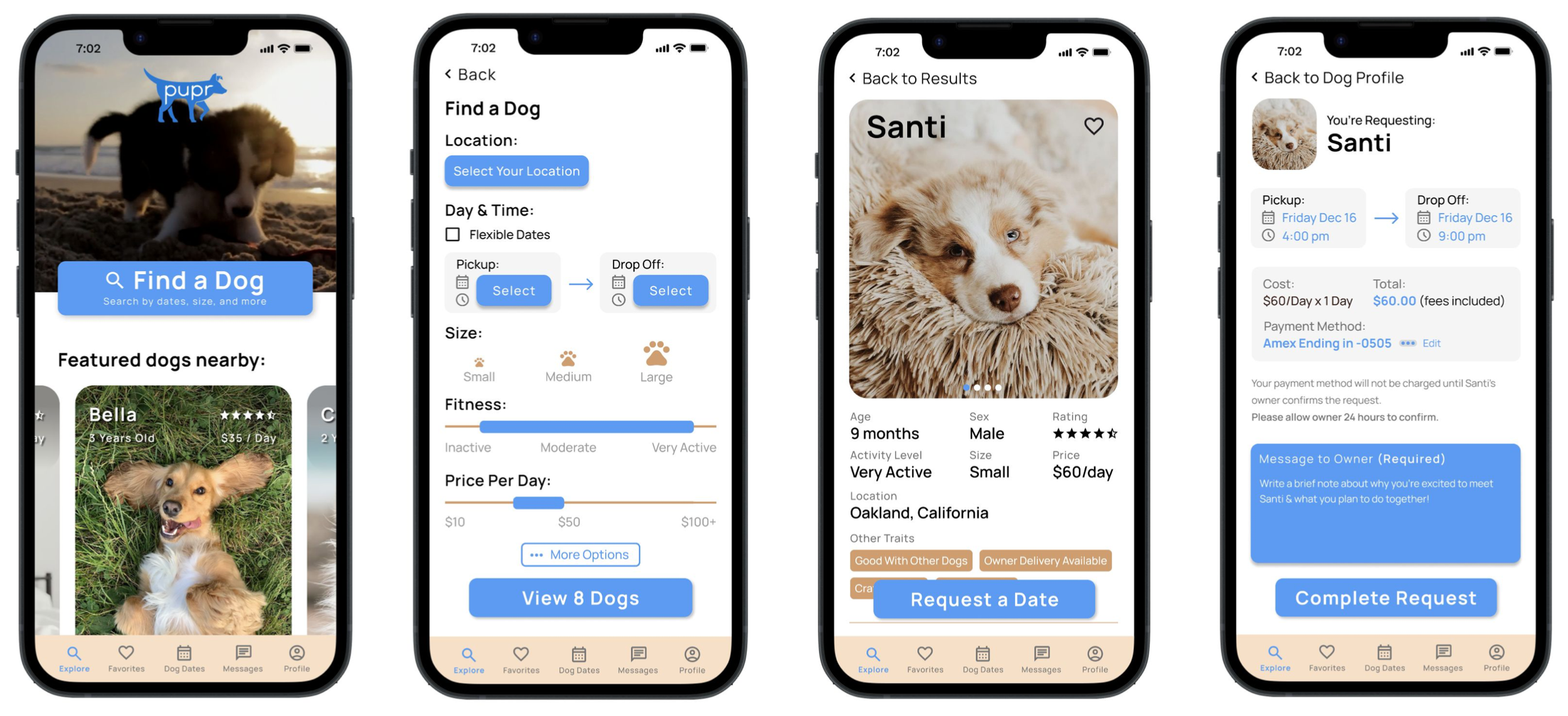
Final Design
After a thorough and iterative design process, I arrived at this final design. Feel free to explore the prototype below!
“I love all the cute doggos and the concept is great. I wish this really existed. Two paws up! 🐾”
- Study Participant #4
Sticker Sheet / Design System

CONCLUSION
This project was an incredible learning experience. Some key takeaways:
Having a high-fidelity prototype for user testing really helped users engage meaningfully with the product. The low-fidelity version was great for testing with other UX designers (similar to testing with an internal team) but regular users were confused by the lack of information.
I’ve been doing a similar design process for years as a freelancer - from broad ideation to refinement to testing, this has been my SOP with any large client project.
Great questions get great answers. For my second usability study, I really took the time to craft thoughtful questions, and the participants provided excellent input as a result. This level of actionable feedback is often missing in graphic design, and I’m excited to engage in a more user-focused and actionable design process in UX & Product.